Customize your menu's look in the Customize tab
Set your brand color, logo, fonts, layout and advanced colors in the Customize tab, with a live preview that updates as you go.
The Customize tab is where you control how your digital QR menu looks to diners, from your brand color and logo to fonts, layout, and image placement. Every change shows up instantly in the live preview on the right and saves either automatically or with one click, so what you see is exactly what your customers get.
Open the Customize tab
Log in to your Vino dashboard and open the Design section. The Customize tab is open by default, so you should land on it straight away; if another tab is active, click Customize in the thin tabs row at the top.
Find the controls and live preview
The Design page is split into two columns. On the left you will see the customization controls grouped into panels; on the right you will see a live preview of your actual public menu. As you change settings, the preview updates immediately so you can judge the result before committing. A device toggle at the top of the preview lets you check the mobile, tablet, and desktop views.
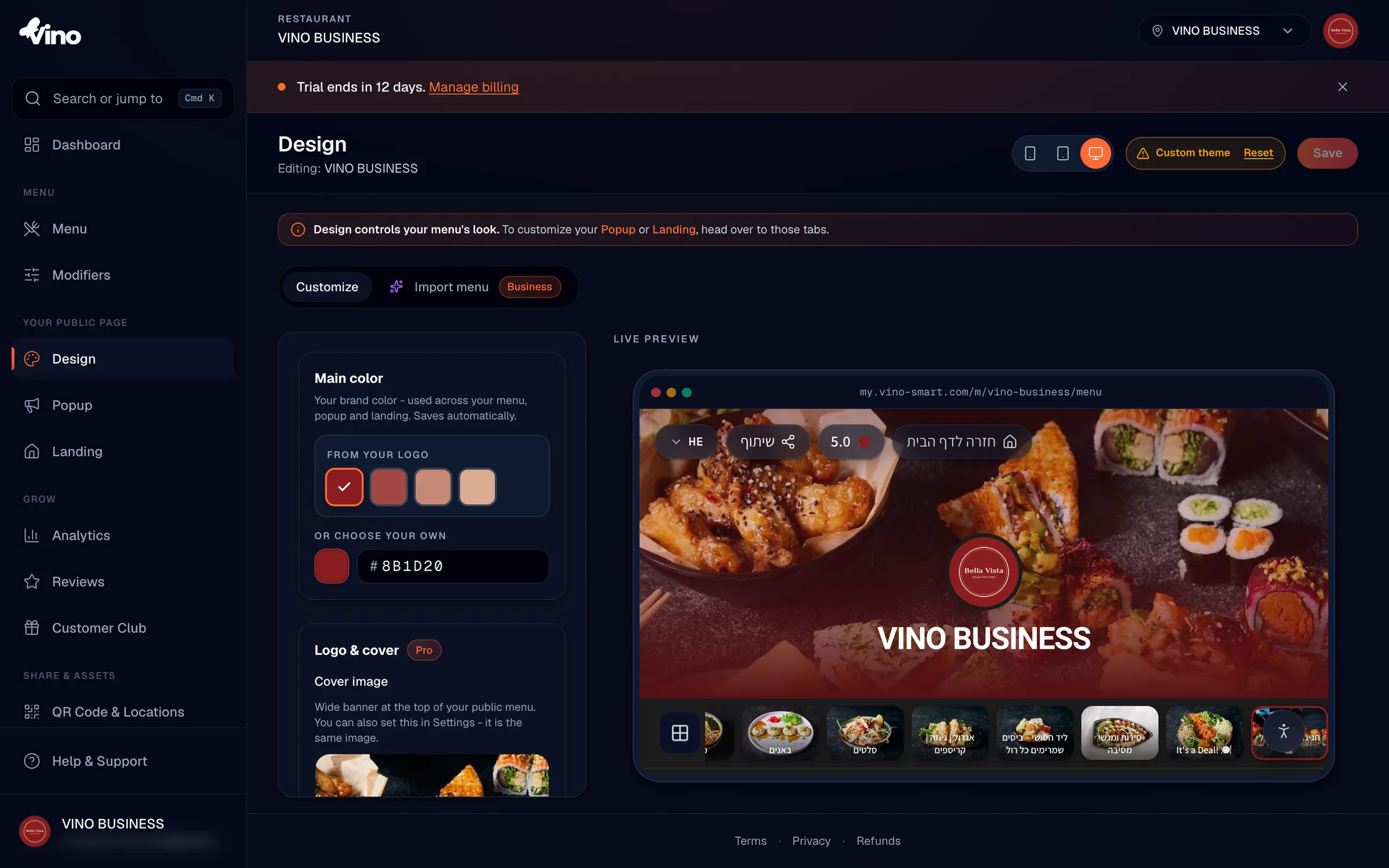
Set your main brand color
Start with Main Color. Click the color swatch or the text input box and pick a color, or type a hex code directly. If you have a logo uploaded in Settings, Vino suggests colors extracted from it under "From your logo" so your menu matches your branding in one click. Your main color is applied across your menu, popups, and landing page, and it saves automatically as you choose.
The main color saves on its own a moment after you pick it, so there is no Save step for this control. Keep it consistent with your logo for a polished, recognizable menu.
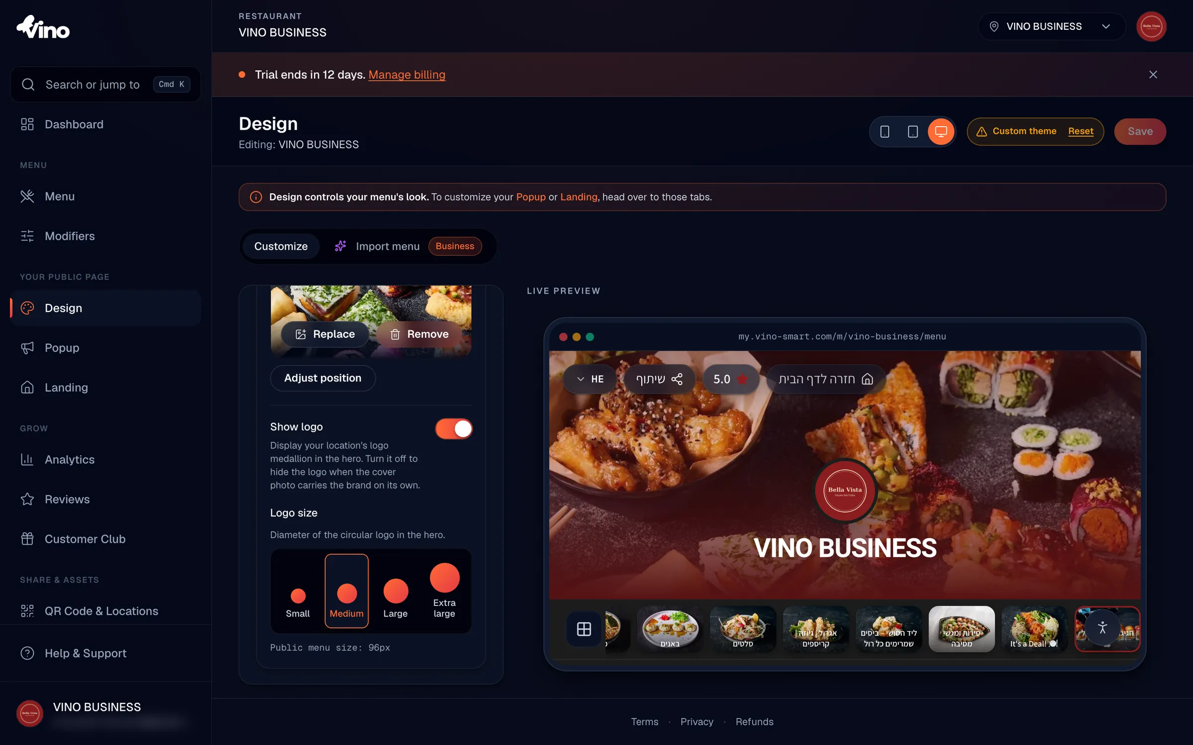
Add a logo and cover photo
Scroll down to the Logo & Cover section. Click Upload image to add a wide cover photo (banner) to the top of your menu; this is the same image used in Settings. After uploading, click Adjust position to drag and frame the photo the way you want it. Use the Show logo toggle to display or hide your restaurant's logo medallion in the header, and pick a logo size with the size buttons.
| Logo size | Diameter |
|---|---|
| Small | 64px |
| Medium (default) | 96px |
| Large | 128px |
| Extra Large | 160px |
Open the Advanced section
To reach the rest of the customization options, scroll down and click the Advanced section to expand it. Inside you will find sub-sections for colors, fonts, text sizes, menu layout, the hero photo, and social links.
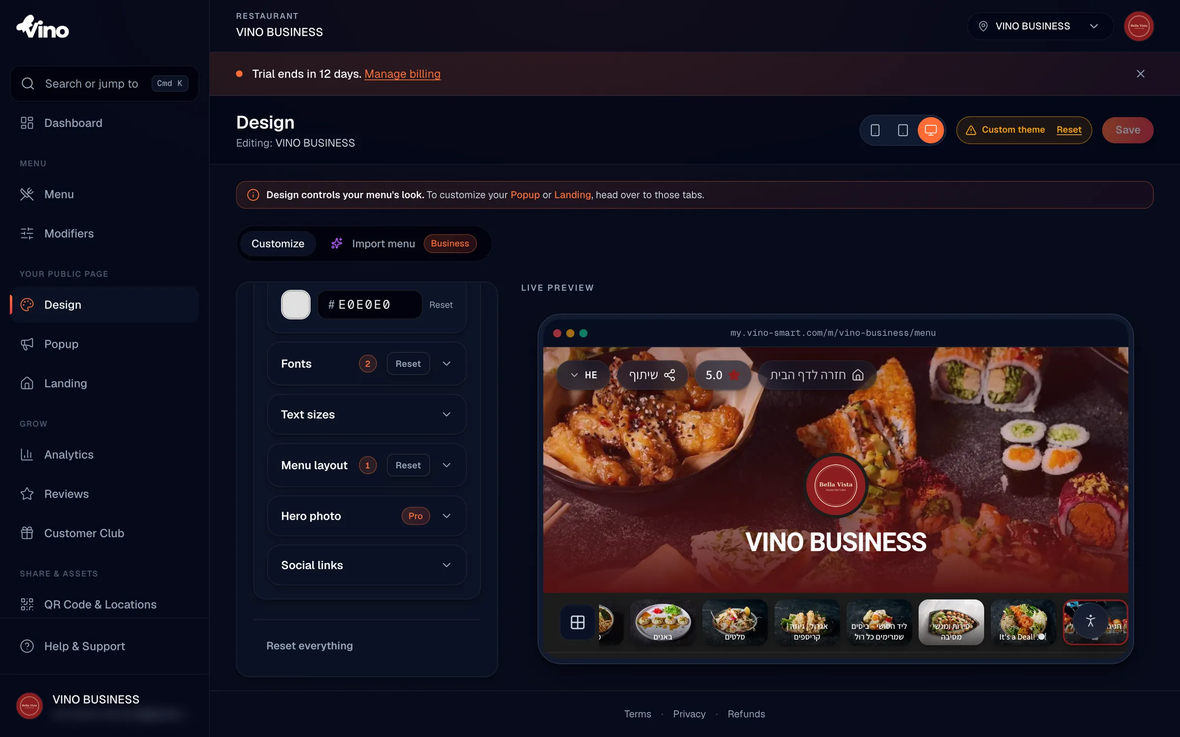
Fine-tune colors
In Advanced > Colors, you can adjust three individual colors to refine your palette beyond the main brand color:
- Background color - the page background behind your menu.
- Cards color - the surface color for item cards and category tiles.
- Text color - the primary content text color.
Each has its own color picker plus a Reset button to revert that color to the template default.
Choose your fonts
In Advanced > Fonts, pick a heading font for section titles and prominent text, and a body font for item descriptions and regular text, both from dropdown menus. Each choice updates the preview instantly. Hebrew-compatible families are marked "Hebrew + Latin"; if Hebrew is not enabled for your menu, you will see only Latin fonts.
- Heading font options include: Geist, Playfair, Fraunces, Inter, System, plus Hebrew-compatible families such as Heebo, Rubik, Frank Ruhl Libre, Secular One, Assistant, Suez One, David Libre, Bellefair, and Miriam Libre.
- Body font options include: Geist, Inter, System, Heebo, Rubik, Assistant, Frank Ruhl Libre, Miriam Libre, and David Libre.
Adjust text sizes
In Advanced > Text sizes, set how large your section titles and your restaurant name appear using the size buttons. Choose from Small, Medium, Large, or Extra Large for each.
| Element | Small | Medium (default) | Large | Extra Large |
|---|---|---|---|---|
| Category headers | 24px | 32px | 40px | 52px |
| Page title (restaurant name) | 28px | 36px | 48px | 64px |
Pick a menu layout
In Advanced > Menu layout, choose how your items are arranged on the page.
- Automatic - Vino picks the layout based on how many photos you have.
- Rows - a lean, text-forward list, best when you have few photos.
- Gallery - a photo grid, best when most items have images.
- Featured - spotlights items with photos and lists the rest.
Style the hero photo
In Advanced > Hero photo, control how the cover photo looks at the top of your menu. Set the height to change how much vertical space it takes, and add a darkening overlay so text stays readable over busy imagery.
| Setting | Options |
|---|---|
| Hero height | Compact, Standard (default), Tall |
| Hero overlay | None (default), Subtle, Strong |
Toggle social links
In Advanced > Social links, use the toggle to show or hide your restaurant's social media icons in the menu footer.
Save your changes
Most changes are batched and applied with one click, so when you are happy with the preview, click Save in the top-right corner. The main color saves automatically, and the cover and hero settings commit on their own, but other edits are held until you save, with an "Unsaved changes" badge reminding you when something is pending.
Use the device toggle above the preview to check your menu on mobile, tablet, and desktop before saving, since most diners will view it on a phone.
Reset to defaults
If you want to start over, scroll to the bottom and click Reset everything to undo all customizations and return to the template defaults. You can also reset individual colors with the Reset button beside each one in Advanced > Colors.
Still stuck? Email us at info@vino-smart.com and we will help you get your menu looking just right.
Was this helpful?