What your customers see when they scan
A walkthrough of the diner experience: scanning the QR, the optional landing page, browsing categories and items.
When a diner scans your QR code or opens your menu link, they get the public-facing experience that drives your revenue: a clean menu they can browse by category, items they can tap for full details, instant language switching, and an optional branded welcome screen. This article walks through exactly what your customers see so you know what to expect before you share your code.
Opening the menu link or scanning the QR
Your QR code and direct link both point to the same stable address at /m/[slug]. When a diner opens it, they land on either a welcome landing page or the menu itself, depending on how you've configured your location. Because the QR always points to the same place and simply branches based on your settings, you never need to reprint a code when you turn the landing page on or off.
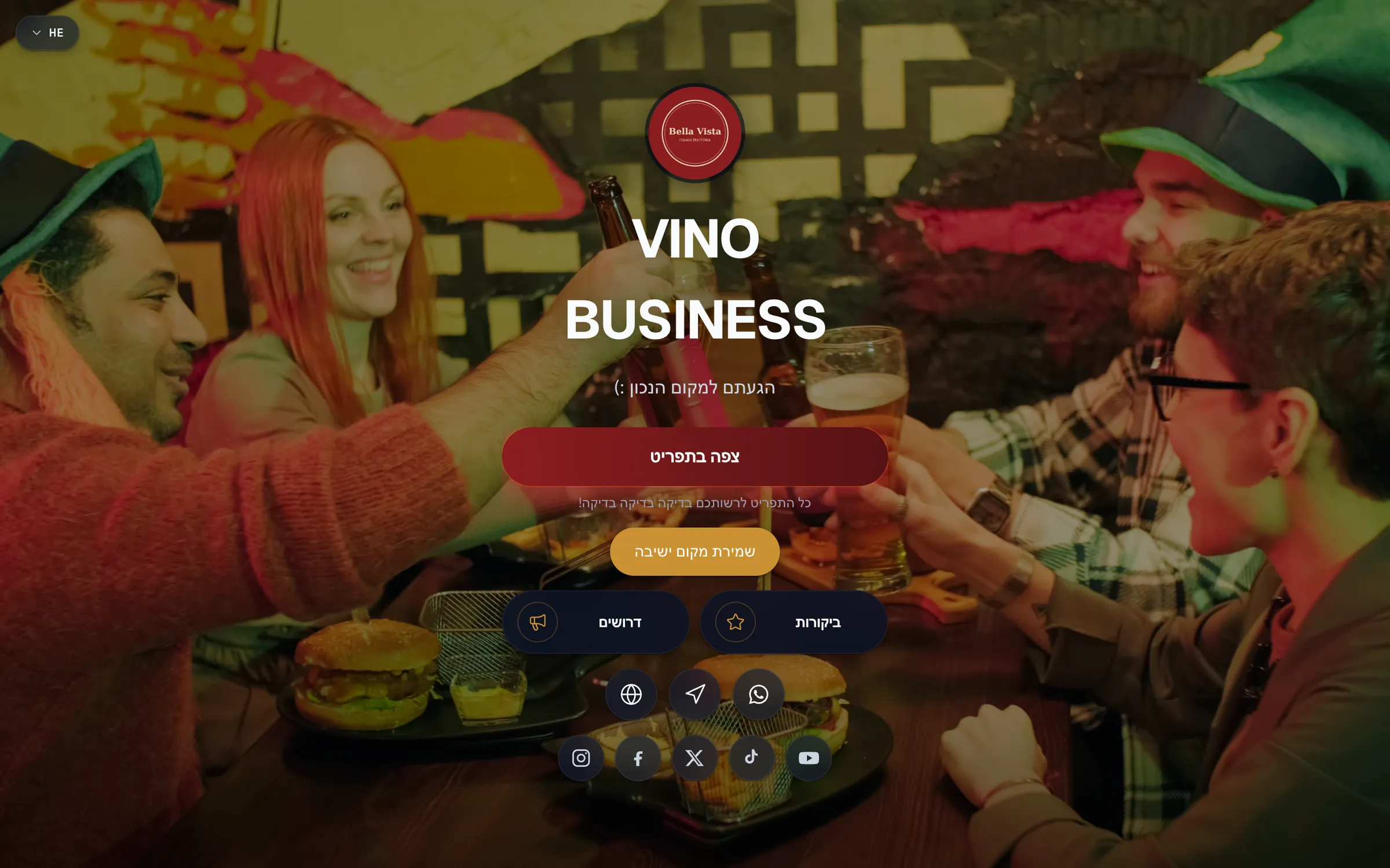
The optional landing page
If you've enabled a landing page, diners see a branded welcome screen first, your cover image, restaurant name, and call-to-action buttons. They tap View menu to open the full menu, which uses a smooth visual transition. If you haven't enabled a landing page, the link goes straight to the menu with no extra step.
The landing page is opt-in per location. See Build a branded landing page for setup.
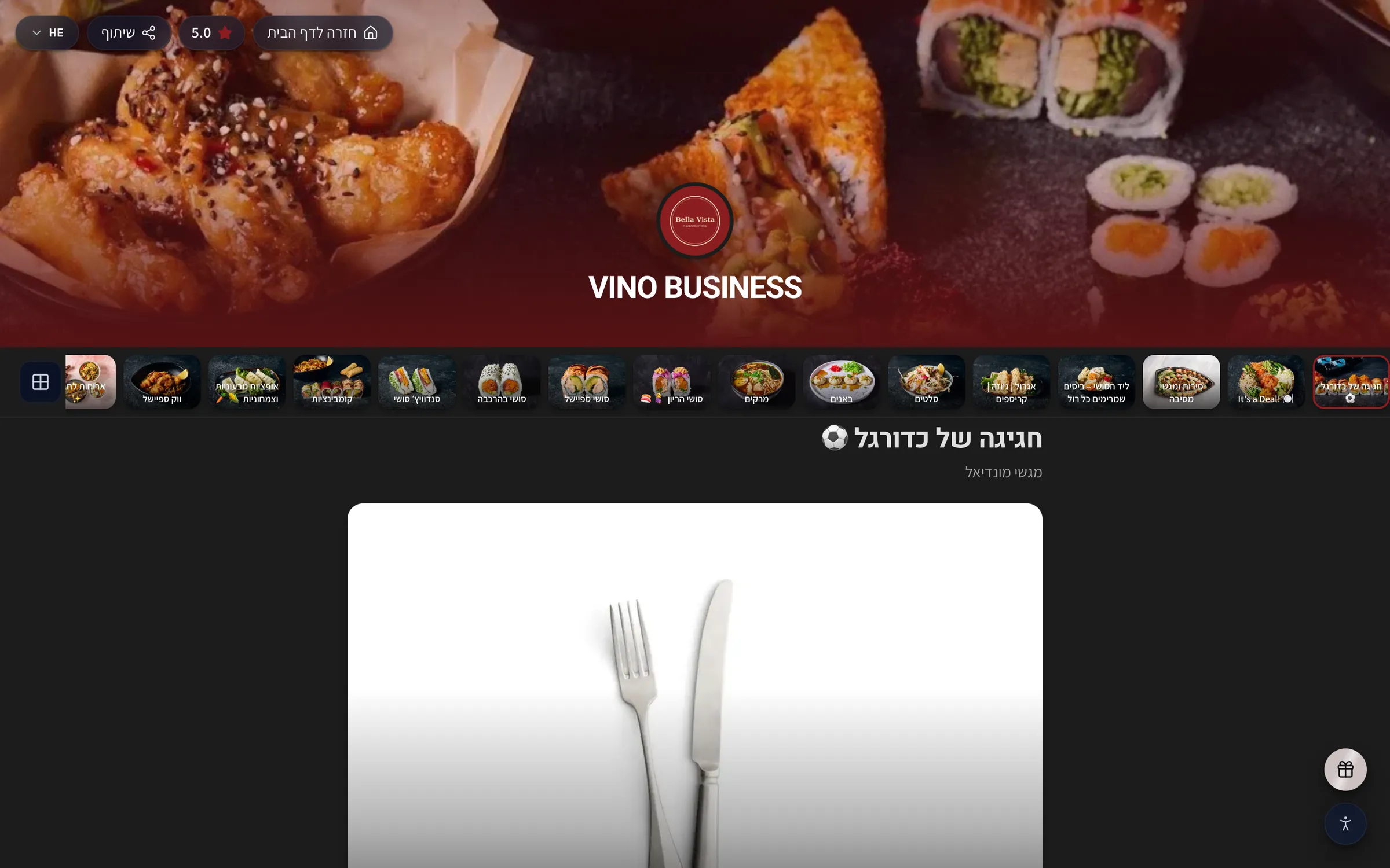
Browsing categories
On the menu, a rail of category photo tiles sits at the top. Diners tap a tile to jump straight to that section. The rail is sticky, so it pins to the top of the screen and stays visible as they scroll, making it easy to move between sections of a long menu. Each tile uses your category photo, or falls back to your restaurant logo or a branded placeholder.
The overall menu layout is resolved automatically based on how many photos you've added:
| Layout | What diners see |
|---|---|
| Rows | A traditional list of items |
| Gallery | A 2-column photo grid for a visual menu |
| Featured | A highlighted hero item above the rows |
Viewing item details
Tapping any menu item opens its detail sheet with everything a diner needs to decide:
- The item photo (when you've added one)
- The price
- The full description
- Allergens and dietary tags
- Available options, such as variations and modifiers
Diners close the sheet by tapping the X or swiping down. You can also deep-link straight to a specific item, the address /m/[slug]/menu?item=<id> opens the menu with that item's sheet already showing.
Switching languages
A language selector sits in the top-right of the menu (showing options like EN, PT or HE). Diners tap it to see every language you've enabled, then tap to switch instantly, the header, categories and all text update to the selected language. Switching works on both the landing page and the menu, and a diner's choice is kept for their browsing session. Right-to-left languages such as Hebrew and Arabic automatically flip the layout direction. See Diner language switching for more.
Hours, reviews and loyalty
Near the top of the menu, an open-status badge shows whether you're currently open or when you open next. If you've enabled them, diners can also see your aggregate rating and recent reviews. Diners can join your loyalty program through an opt-in "Join the club" card and a floating button.
Promotional popups
You can show diners a timed promotional popup, a modal with a call-to-action that appears as they browse. This is a great way to highlight a special, an event or a sign-up offer.
Accessibility and the footer
An accessibility menu (a small icon in the bottom-left) lets diners increase text size, enable high contrast, or reduce animations. Their preferences are saved across visits, so the menu stays comfortable for returning customers. Scrolling to the bottom reveals your contact info, directions, social links, and the optional loyalty sign-up.
Still stuck? Email us at info@vino-smart.com and we'll help you get your menu looking right for diners.
Was this helpful?