Restaurant Menu Analytics: 8 Metrics That Drive Revenue
Discover 8 restaurant menu analytics metrics that drive revenue. Learn how to track item views, conversion rates, browse depth, and more to optimize your menu.

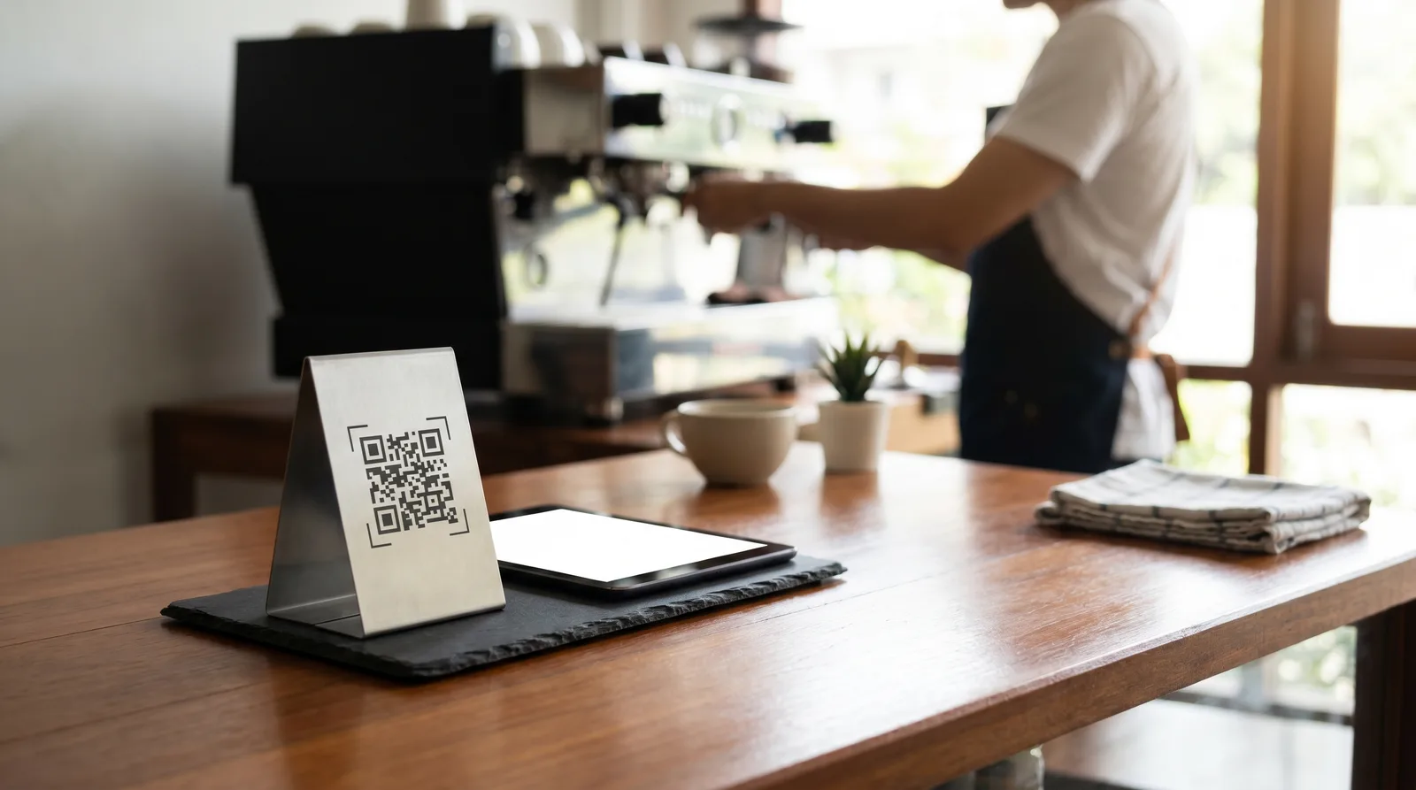
You redesigned your menu last quarter. You moved the pasta section higher, added photos to four dishes, and raised the price on your best-selling burger by a dollar. Revenue went up 6%. But which change caused it? With a paper menu, you'll never know. With restaurant menu analytics, you'll know by Thursday.
Digital menus don't just display your food - they generate data on exactly how guests interact with every item, category, and price point. The problem is that most restaurant owners either don't track this data or don't know which metrics actually matter. These eight do.
1. Item View Rate
What it measures: The percentage of guests who view a specific menu item out of all guests who open your menu.
Why it matters: An item can't sell if nobody sees it. Low view rates reveal positioning problems - the item is buried in a long category, placed below the scroll fold, or sitting in a category guests skip entirely.
What to do with it: If a high-margin item has a view rate below 15%, move it higher in its category, add a photo, or feature it in a "Chef's Picks" section. According to Cornell's Center for Hospitality Research, items in the first three positions of a digital menu category receive 2.5x more views than items at the bottom.
2. Item Conversion Rate
What it measures: The percentage of guests who view an item and then order it.
Why it matters: This is the single most important metric in restaurant menu analytics. A high view rate with a low conversion rate means guests are looking but not buying - a signal that the description is weak, the price feels wrong, or the photo isn't appetizing.
What to do with it: Compare conversion rates across similar items. If your $18 chicken parmesan converts at 22% but your $19 grilled salmon converts at 6%, the salmon needs work - better photography, a more compelling description, or a repositioned price point. For strategies on price presentation, see our guide on digital menu pricing psychology.
3. Browse Depth
What it measures: How far through your menu the average guest scrolls - measured by categories viewed, items seen, or scroll percentage.
Why it matters: If guests only browse two of your seven categories before ordering, five categories are essentially invisible. Low browse depth often indicates a menu that's too long, poorly organized, or front-loaded with items that satisfy the guest before they explore further.
What to do with it: If browse depth is low, restructure your categories. Lead with your highest-margin category, not your most obvious one. Use category tabs or horizontal navigation so guests can jump directly to sections that interest them without scrolling past everything else.
4. Time on Menu
What it measures: How long guests spend browsing your digital menu before placing an order or closing it.
Why it matters: There's a sweet spot. Too short (under 60 seconds) suggests guests are ordering reflexively - grabbing the first familiar item without exploring. Too long (over five minutes) suggests confusion, decision paralysis, or a menu that's hard to navigate.
What to do with it: The ideal range for most casual dining restaurants is 2-4 minutes. If you're well below that, your menu may need more visual appeal (photos, descriptions) to encourage exploration. If you're well above, simplify: reduce the number of items, shorten descriptions, or improve category organization.
5. Add-On and Modifier Rate
What it measures: The percentage of orders that include add-ons, upgrades, or modifiers (extra toppings, side upgrades, drink pairings).
Why it matters: Add-ons are pure margin. A guest who upgrades from regular fries to truffle fries at $3 extra, or adds a side salad for $4, increases your check size without increasing kitchen complexity significantly. This metric tells you whether your menu is effectively prompting these additions.
What to do with it: If your add-on rate is below 20%, the problem is usually visibility. Digital menus can surface add-on suggestions automatically during the ordering flow - "Add a side?" or "Pair with our house wine?" - and with Vino's platform, promo popups and well-placed pairings put those suggestions in front of every browsing guest. Restaurants that implement smart upsell prompts typically see add-on rates jump from 15% to 35%.
6. Peak Browsing Windows
What it measures: The times of day and days of the week when your digital menu receives the most views.
Why it matters: This data reveals when your guests are making dining decisions - which may not align with when they actually arrive. Many restaurants see a spike in menu views between 11:00 and 11:30 AM (lunch planners) and 4:30 and 5:30 PM (dinner planners). If you're running specials or featuring high-margin items, these are the windows to optimize for.
What to do with it: Schedule menu updates to coincide with peak browsing. If you offer a lunch special, make sure it's prominently featured before the lunch browsing window - not added at 12:15 when half your potential diners have already decided.
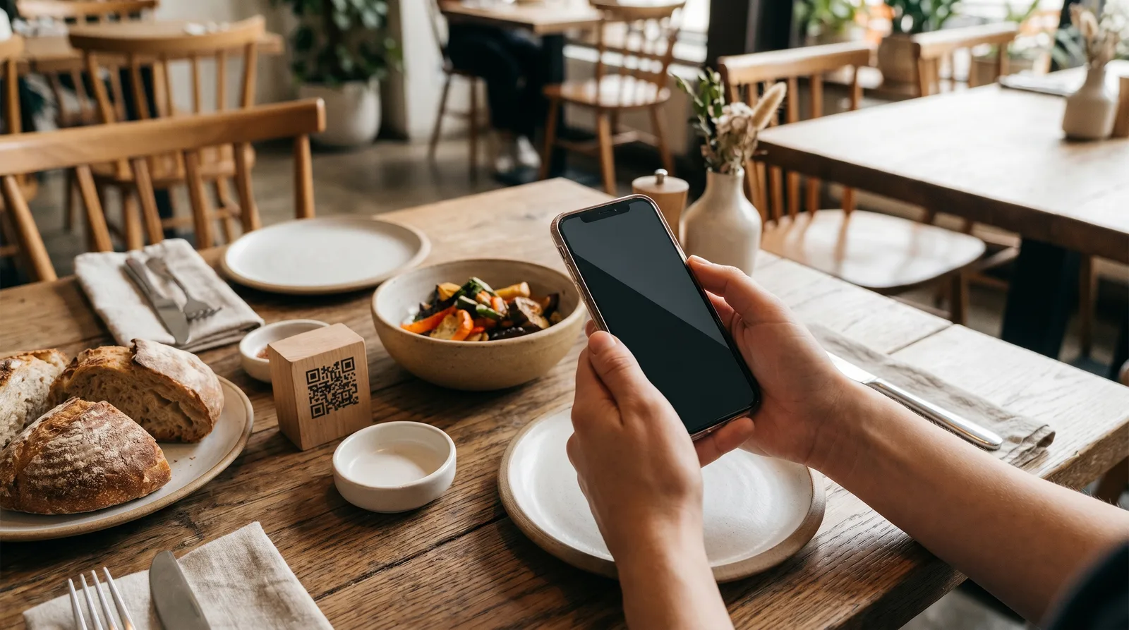
7. Cart Abandonment Rate
What it measures: The percentage of guests who add items to a digital order but don't complete the purchase (applicable for scan-to-order systems).
Why it matters: A high abandonment rate (above 25%) signals friction in the ordering process: a confusing checkout flow, unexpected fees or minimums, or a payment step that's too complicated.
What to do with it: Simplify the checkout. Reduce the number of taps to complete an order. Remove mandatory fields that aren't essential. If you're charging a service fee, disclose it upfront - surprising guests at checkout is the fastest way to lose the order.
8. Items Per Order
What it measures: The average number of distinct items per order (not total quantity - distinct line items).
Why it matters: This metric reflects how effectively your menu encourages exploration beyond a single entree. A restaurant averaging 1.8 items per order has significant room to grow compared to one averaging 3.2 items per order.
What to do with it: Cross-reference with browse depth. If guests are only viewing one or two categories and ordering 1.5 items, the fix is getting them to explore more of the menu. Category highlights, "popular pairings" suggestions, and strategic use of photos in underperforming categories all help.
Turning Restaurant Menu Analytics Into Action
Data without action is just overhead. Here's a weekly review habit that takes 15 minutes and moves the needle:
Every Monday morning:
- Pull your top 5 and bottom 5 items by conversion rate.
- Check if any high-margin item has dropped in views or conversions since last week.
- Look at your add-on rate - is it trending up or flat?
- Note your average items per order and compare to the prior four weeks.
Monthly:
- Re-evaluate item positioning based on view rate data. Move underperforming high-margin items up.
- Test one change - a new photo, a revised description, a repositioned item - and measure the impact over 30 days.
- Review browse depth. If it's declining, your menu may be getting too long or too repetitive.
A Note on Privacy and Data
Restaurant menu analytics collects behavioral data - what guests view and order - not personal data. Most digital menu platforms, including Vino, don't require guests to create accounts or share personal information to browse a menu. The data is aggregated and anonymized.
That said, if you operate in the EU, ensure your platform complies with GDPR requirements for any data collection. If you collect email addresses through your ordering system, you need explicit consent. For more on first-party data strategies, see our guide on restaurant first-party data and digital menus.
Start Measuring What Matters
Paper menus are blind. You print them, hand them out, and hope for the best. Digital menus with analytics turn every service into a source of insight - what's working, what's not, and what to change next. The eight metrics above aren't academic exercises. They're the levers that separate restaurants guessing at menu performance from restaurants engineering it. Pick one metric this week, start tracking it, and make one data-driven change. Then do it again next week. That's how menus get optimized - not in a single redesign, but in a hundred small, measured adjustments.
Ready to go digital?
Create your restaurant's smart digital menu in minutes with Vino. No app downloads, no complicated setup.