10 Restaurant Menu Design Tips for Mobile in 2026
10 actionable restaurant menu design tips for mobile screens. Learn why paper menu rules fail on phones and how to boost orders with mobile-first design.
Your beautifully designed paper menu - the one with the elegant typeface, the two-column layout, and the subtle border illustrations - looks terrible on a phone. Pinch-zoom, horizontal scrolling, text too small to read, images that take forever to load. A paper menu scanned as a PDF is not a mobile menu. It's a desktop document held hostage on a 6-inch screen.
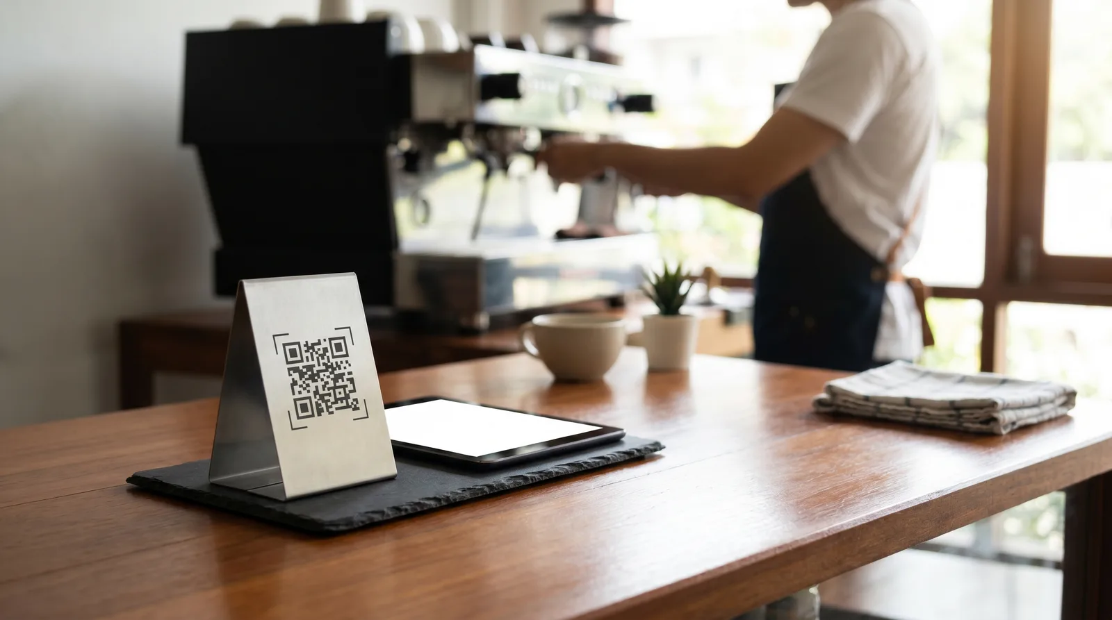
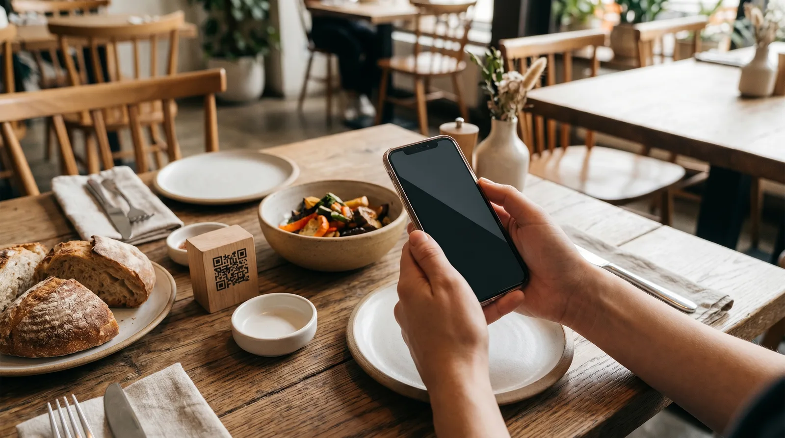
In 2026, with 70-85% of restaurant guests using QR codes to access your menu on their phones, mobile-first design isn't optional. These 10 restaurant menu design tips will help you build a menu that works the way your guests actually use it.
Why Paper Menu Rules Don't Work on Mobile
Paper menus are designed for two hands, 8.5 x 11 inches (or larger), and a reading distance of 14-18 inches. Mobile screens are used one-handed, measure 6 inches diagonally, and are held 10-12 inches from the face.
Every design principle changes: columns become single-scroll layouts, font size minimums jump from 9pt to 16px, and visual hierarchy shifts from spatial arrangement to vertical sequencing. Trying to translate a paper menu directly to mobile is like printing a billboard on a business card. The content is the same; the experience is unrecognizable.
Here are the 10 restaurant menu design tips that actually work on mobile.
1. Lead with Your Strongest Category
On paper, guests see your entire menu at once and self-navigate. On mobile, they see what's at the top and scroll down. The first category they encounter sets the tone and anchors their ordering mindset.
Lead with your highest-margin or most popular category - not necessarily appetizers. If your burgers drive 40% of orders and have your best margins, put them first. A Popmenu study of 1,000+ restaurants found that items in the first category viewed receive 35% more orders than equivalent items in later categories.
2. Write Short, Specific Descriptions
On a phone, every line of text competes for scarce vertical space. Keep item descriptions to one or two lines maximum - 15 words is a good target.
Too long: "Our hand-formed Angus beef patty is seasoned with our proprietary blend of herbs and spices, grilled over an open flame to your preferred doneness, and served on a locally baked brioche bun with crisp lettuce, vine-ripened tomato, and our signature house-made aioli."
Just right: "Hand-formed Angus patty, open-flame grilled, brioche bun, house aioli."
The short version communicates the same quality in a quarter of the space. Guests scanning a mobile menu make decisions in seconds - dense paragraphs slow them down and increase decision fatigue.
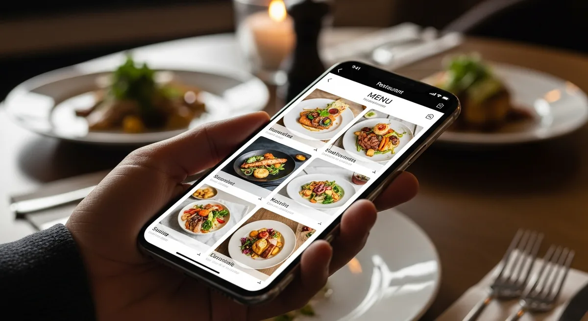
3. Use Horizontal Food Photos, Not Vertical
Portrait-oriented food photos take up too much vertical scroll space on mobile. Landscape (horizontal) crops - or square crops at most - keep your menu compact while still showcasing the dish. The ideal aspect ratio for mobile menu images is 16:9 or 3:2.
Not every item needs a photo. Feature your top 3-5 items per category with professional-quality images and leave the rest as text-only. This approach is both visually cleaner and faster to load.
4. Limit Yourself to Two Fonts
Paper menus can get away with decorative script fonts, serif headers, and specialty typefaces. Mobile screens cannot. Small font sizes and low screen resolution turn ornate typefaces into illegible mush.
Use one sans-serif font for body text (16px minimum) and one accent font for headings. That's it. Consistency creates visual rhythm that helps guests scan quickly - and scanning is how people read menus on phones.
5. Design for the Thumb Zone
Hold your phone naturally with one hand. Your thumb comfortably reaches the bottom two-thirds of the screen but strains to hit the top corners. This is the "thumb zone," and it's where your most important interactive elements should live.
Place category navigation tabs, the order/cart button, and any filters in the bottom third of the screen. Avoid putting critical actions in the top corners where they require an awkward grip shift. Most modern digital menu platforms, including Vino, are built with thumb-zone navigation as a default.
6. Use Sticky Category Tabs
On a paper menu, category headers are visible within the layout. On mobile, once a guest scrolls past the "Appetizers" header into "Entrees," they lose the ability to jump back without scrolling manually.
Sticky category tabs - a horizontal row of tappable category names that stays fixed at the top (or bottom) of the screen as the guest scrolls - solve this. They let guests jump between sections instantly and are the single biggest UX improvement for mobile menus.
7. Drop the Currency Symbols
Menu pricing psychology research from Cornell's School of Hotel Administration has consistently shown that menus without currency symbols ($, EUR) see higher average check sizes. The symbol triggers "price pain" - a subconscious reminder that money is leaving the guest's wallet.
Instead of "$18.00," display "18" or "18.00." This applies even more strongly on mobile, where the menu is displayed on the same device guests use for banking and expense tracking. The association is stronger. For more pricing strategies, see our guide on digital menu pricing psychology.
8. Highlight 2-3 Items Per Category
When every item is highlighted, nothing is highlighted. Pick two or three items per category to feature - using a "Popular," "Chef's Pick," or subtle visual badge - and leave the rest unadorned.
This serves two purposes: it reduces decision fatigue for guests who want guidance, and it steers orders toward your highest-margin dishes. The featured items should be your best combination of margin and quality - not just the most expensive.
9. Make Allergens and Dietary Info Visible, Not Hidden
On paper menus, allergen information is typically a footnote or a separate insert. On mobile, it should be inline - visible icons (V for vegan, GF for gluten-free, a nut icon for tree nuts) displayed next to each relevant item.
This isn't just good design - it's increasingly a legal requirement. The EU's Food Information Regulation requires allergen disclosure, and similar rules are expanding in the US and UK. Making this information immediately visible also speeds up decision-making for the growing segment of guests with dietary restrictions. For more on compliance, check our guide on digital menu accessibility and compliance.
10. Obsess Over Load Time: 3 Seconds Max
None of the above matters if your menu takes eight seconds to load. According to Google's Core Web Vitals benchmarks, the largest contentful paint (LCP) should occur within 2.5 seconds for a "good" user experience. Every additional second of load time reduces conversion by 7%.
To hit this target: compress images aggressively (WebP format, under 100KB per image), minimize the number of fonts loaded, avoid heavy JavaScript frameworks, and use a digital menu platform with optimized delivery infrastructure rather than building a custom solution on a general-purpose website builder.
Testing Your Mobile Menu Design
Design is hypothesis. Testing is proof. Before rolling out changes to your entire menu:
- A/B test one change at a time. Move a category position, add a photo, or change a description - then measure the impact on views and orders for two weeks before making it permanent.
- Test on real devices. Not just your iPhone 16 - test on a three-year-old Android phone with a cracked screen on a slow connection. That's what many of your guests are using.
- Watch real guests. Sit in your dining room and observe. Where do guests pause? Where do they pinch-zoom? Where do they look confused? Five minutes of observation reveals more than any analytics dashboard.
Build for the Screen They're Actually Using
The best restaurant menu design tips for mobile all share one principle: respect the constraints of the medium. A 6-inch screen, one-handed use, a 3-second attention window, and a guest who wants to decide quickly and confidently. Design for that reality - not for the paper menu you're used to - and you'll see faster decisions, higher check averages, and fewer guests asking "can you just tell me what's good?"
Start by auditing your current mobile menu against these 10 tips. Fix the biggest gap first, measure the result, and iterate. Your menu isn't a poster - it's a product. Treat it like one.
Ready to go digital?
Create your restaurant's smart digital menu in minutes with Vino. No app downloads, no complicated setup.