Create a promotional popup on your menu
Build an in-menu promotional popup with content, media, trigger and frequency rules, appearance, and a call-to-action button.
A promotional popup is a configurable modal that appears on your public menu so you can highlight first-visit discounts, seasonal specials, limited-time offers, or table-side announcements. You control exactly when it appears, how often repeat visitors see it, and whether it includes a clickable call-to-action button, so it grabs attention without annoying your diners.
Open the Popup editor
Log in to your Vino dashboard and open Popup from the main menu, under the Promotions area. The page shows the promotional modal for your current location, with the editor form on the left and a live preview in a simulated phone frame on the right. If you run more than one restaurant, the popup is configured separately per location, so switch to the venue you want before you start.
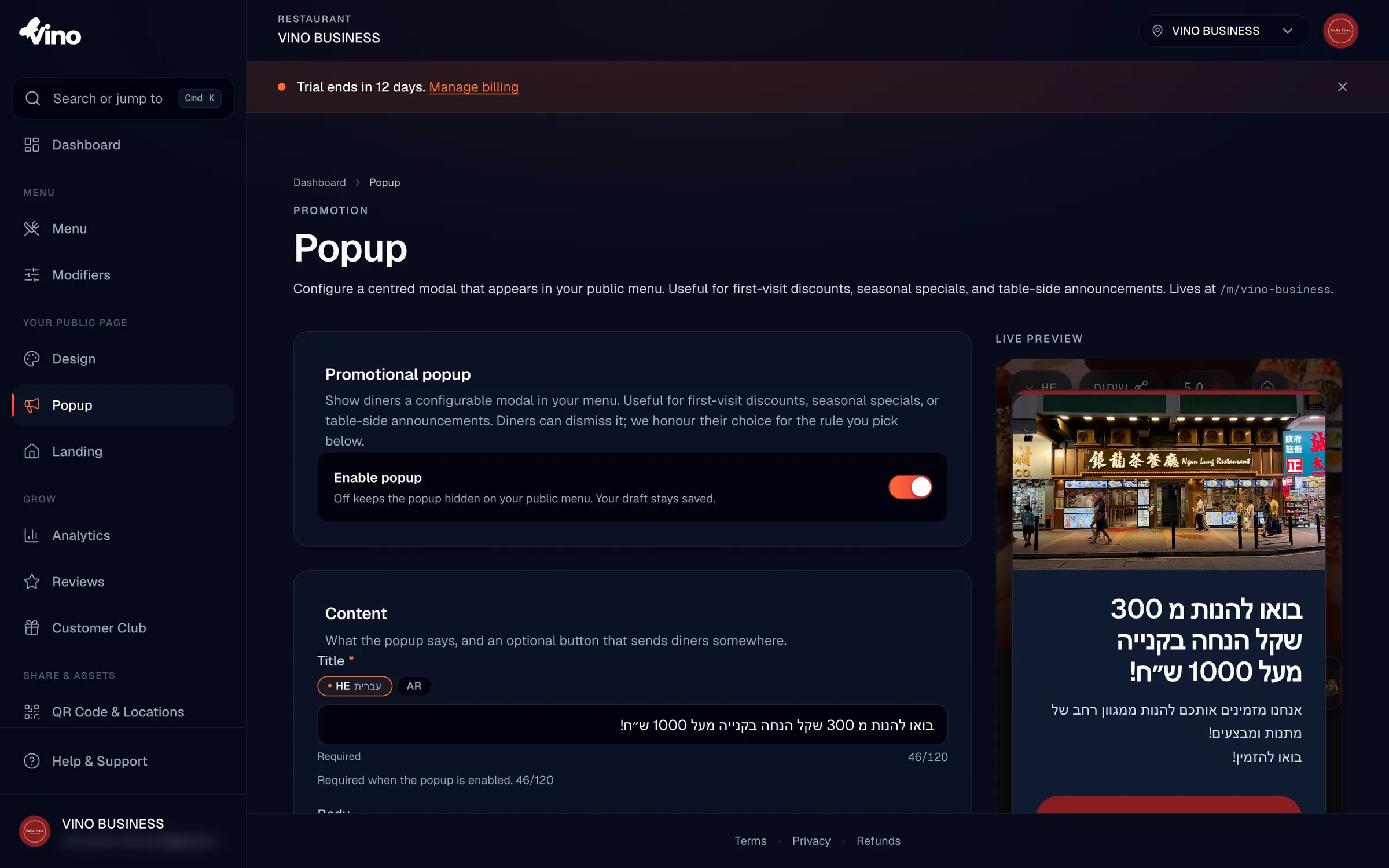
Enable the popup
Toggle the Enable Popup switch ON to make your popup appear on the public menu. Toggling it OFF hides the popup from diners while keeping your draft configuration saved, so you can prepare a promotion in advance and switch it on the moment it goes live. Nothing shows to diners until both the toggle is on and you have saved your changes.
Write your content
In the Content section, type a Title (required when the popup is enabled, up to 120 characters) and an optional Body (up to 500 characters) describing your promotion. The body supports line breaks with the Enter key. If your restaurant has two or more enabled languages, use the language tabs to write a version of each field per language; missing translations fall back to your default language on the public menu.
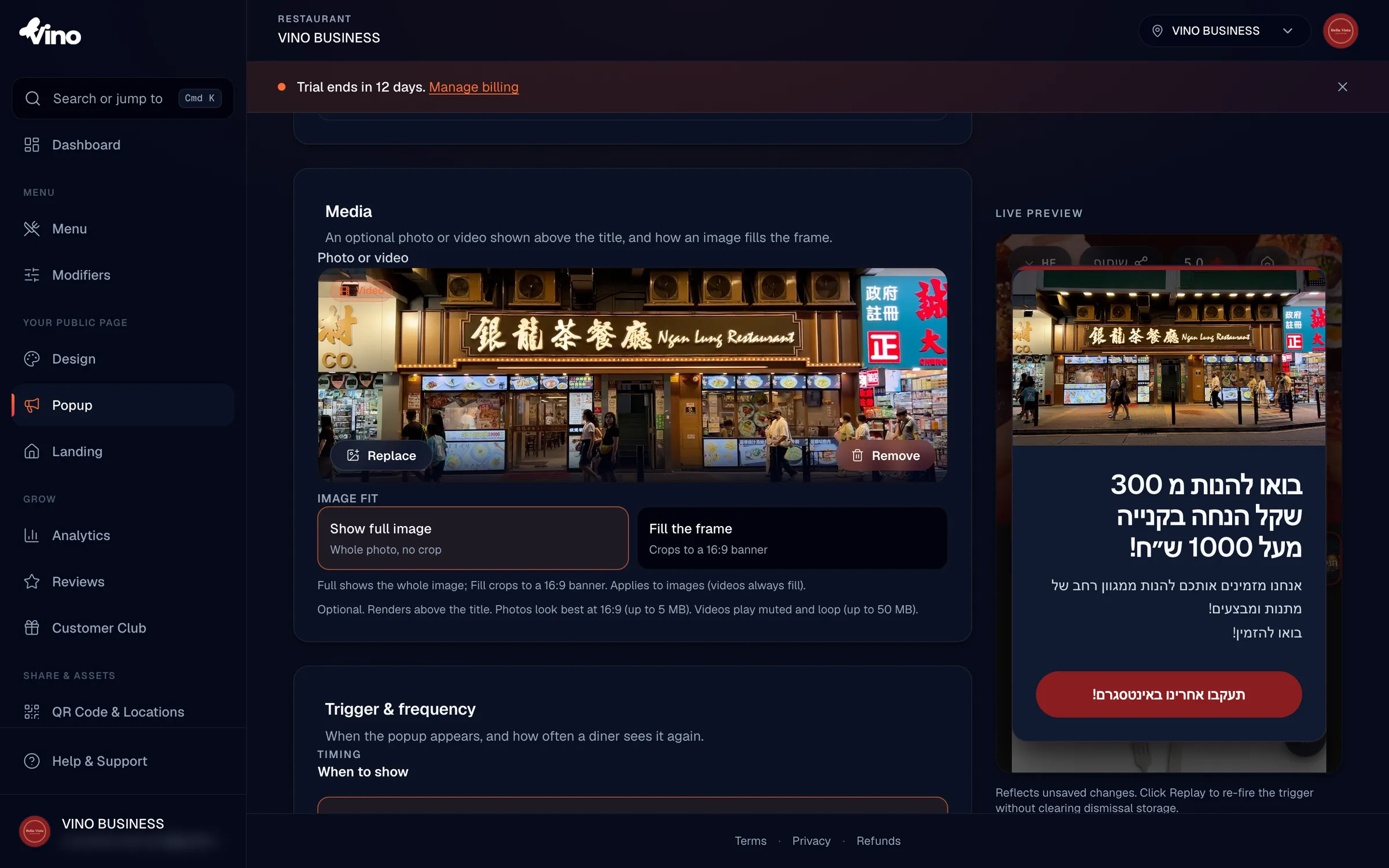
Add a photo or video (optional)
Under Media you can click Photo or Video to display visuals above your text. Images can be up to 5 MB (best at a 16:9 ratio) and videos up to 50 MB (they loop muted). For a photo, choose Show Full Image to display the entire picture without cropping, or Fill the Frame to crop it to a 16:9 banner; videos always fill the frame. Image and video are sibling fields, so upload one, the other, or neither. If you upload both, the video plays on the public menu with the image as a fallback.
Add a call-to-action button (optional)
Click Add a Button to include a clickable button on your popup. Enter the Button Label (up to 40 characters) and the Button URL it should open, such as a website offer page or a phone number. Both fields must be filled together or both left empty. A bare label without a link, or a link without a label, will fail to save with an inline error. URLs are normalized automatically, so entering www.example.com is stored as https://www.example.com.
Set the trigger and frequency
In Trigger & Frequency, decide when the popup shows and how often repeat visitors see it. The combination of these two settings is what keeps a promotion noticeable without becoming intrusive. The table below summarizes your options.
When to show:
| Option | Behavior |
|---|---|
| When the Page Loads | Appears about 600ms after the menu opens, giving the page time to paint first |
| After a Delay | Enter a number of seconds (1-300) to wait before the popup appears |
| At Scroll Depth | Enter a scroll percentage (1-95%) at which the popup fires |
How often:
- Once per Session - hidden again until the visitor closes the browser tab.
- Once per Day - hidden until the next calendar day.
- Every Visit - shows every time the menu loads. Use this sparingly, as it can annoy repeat visitors.
When diners dismiss the popup with the X button, Vino remembers their choice in browser storage using the frequency rule you selected.
Customize the appearance (optional)
In Appearance, pick a Size and set custom colors to match your brand. Sizes are Small (360px), Medium (480px, the default), or Large (640px); Small matches a typical phone width and suits mobile-first audiences, while larger sizes show more content but can feel cramped on small phones. You can also set four optional colors:
- Accent Colour - paints the top accent strip and the button fill; defaults to your brand color.
- Background Colour - paints the popup card; defaults to a dark glass surface, with text auto-contrasting for readability when you set a custom color.
- Text Colour - sets the title, body, and close button color; defaults to auto-contrast.
- Button Colour - sets the call-to-action button fill; defaults to the accent color.
Leave every color empty and the popup uses your brand color and default dark background, keeping it visually unified with your menu and landing page.
If you choose a hard-to-read text and background pairing, the editor shows a non-blocking contrast warning. It never stops you from saving, so the choice is always yours.
Preview, save, and go live
As you edit, the live preview on the right updates to reflect your changes. Click Replay Preview to re-fire your trigger and watch the popup appear again without clearing the browser's dismissal storage, so you can test it as many times as you like. When you are happy, click Save Popup. Your changes appear immediately on the public menu, which lives at /m/{your-location-slug}.
The popup overlays your menu as a centered, accessible modal. Diners can dismiss it with the X button, by pressing ESC, or by clicking the dimmed backdrop.
Still stuck? Email our team at info@vino-smart.com and we'll help you get your promotion live.
Was this helpful?