We Analyzed 30,000 QR Menu Interactions. Here Is the Data on How Diners Really Read Your Menu.
A median 59 seconds to a first tap and 18x the opens for photographed dishes: we analyzed 30,569 QR menu interactions to learn how diners read restaurant menus.
On this page 10
Menus get built on instinct. The chef's favorites go up top, a designer picks the layout, and nobody ever finds out what diners actually looked at. We decided to find out. Over one month, from mid-June to mid-July 2026, we analyzed 30,569 interaction events across nearly 3,000 QR menu sessions at more than 20 restaurant venues - anonymized, aggregated diner behavior data from real tables.
The results are blunt. The median time from opening the menu to tapping a first dish is 59 seconds. Photos outperform every other lever we can measure. Placement in the menu order largely decides whether a dish gets seen at all. And in a typical venue, only 20-50% of menu items were opened by any diner all month.
Here are the eight findings, each with the one move an operator can make tomorrow.
1. 91% of sessions happened on a phone - QR menus are an in-the-moment medium
91% of QR menu sessions happened on a phone. And about 9 in 10 sessions arrived direct, with no referrer - the signature of a QR scan at the table rather than a web search.
This is not a website being researched from the couch. It is a menu being read one-handed at the table, in the gap between sitting down and the server's first visit.
The operator move: judge your menu on a phone screen or not at all. If a dish name wraps to three lines, if a category takes effort to reach, if the type is sized for paper - that is the real experience in 91% of sessions.
2. The median first dish tap comes 59 seconds after the menu opens
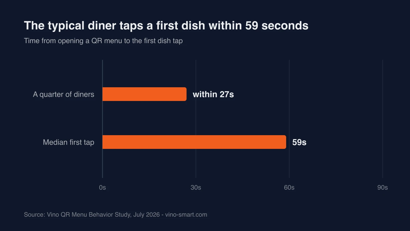
The median time from opening the menu to tapping a first dish was 59 seconds. A quarter of diners tapped a dish within 27 seconds.
That is the whole persuasion window. Whatever a diner sees in that first minute is carrying the sale.
The operator move: put the dishes you most want to sell where the first minute happens. If your best-margin plate sits deep in the menu order, the first minute of attention is spent long before anyone reaches it.
3. An engaged menu session runs about 3 minutes - and the top 10% run past 19 minutes
Among sessions with more than one interaction, the median session ran just under 3 minutes. The top 10% stretched past 19 minutes - diners keeping the menu open through the meal. The remaining sessions were a single quick look, which means the menu gets exactly one glance to earn a second one.
You are serving two audiences at once. The quick look is won or lost on the first screen. The long session is a diner treating the menu as a companion through the meal - and a diner keeping the menu open that long is telling you they might order again.
The operator move: front-load the first screen for the quick look, and keep desserts and drinks easy to find for the diner who comes back to the menu mid-meal.
4. In most venues, categories in the top quarter of the menu capture about 64% of dish opens - the bottom quarter as little as 2-7%
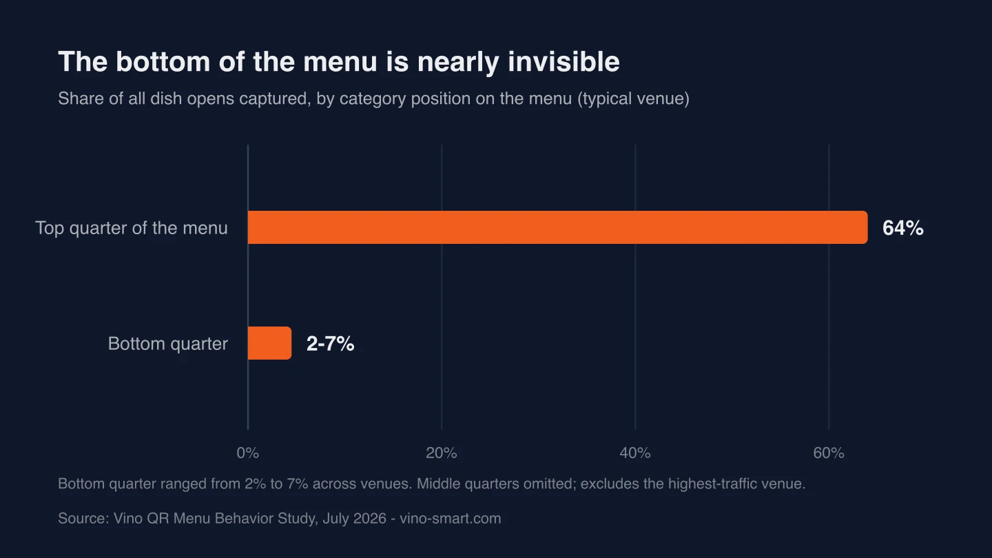
We looked at where dish taps land in the menu order. In most venues, categories in the top quarter of the menu captured about 64% of all dish opens. Categories in the bottom quarter captured as little as 2-7%.
Placement is not neutral. Attention concentrates at the start of the menu and thins out fast, so where you put a dish largely decides whether it gets seen at all. The menu order is not a table of contents; it is a ranking of what you will sell this month.
The operator move: move your highest-margin categories into the top quarter and treat the bottom of the list as an archive. If a dish matters to your numbers, it does not belong in the last category. This is the heart of data-driven menu engineering: margin decides placement, not tradition.
5. Dishes with photos averaged 18x the opens of dishes without - about 9x within the same venue
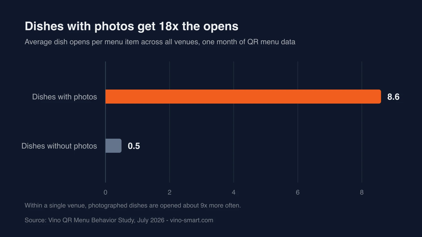
Across all venues, dishes with photos averaged 18x the opens of dishes without - 8.6 opens per item against 0.5. Part of that gap is selection - restaurants that invest in photos also tend to get more traffic - so we compared dishes within the same restaurant, where traffic is held constant. Within the same restaurant, photographed items were opened about 9 times more often than dishes without a photo.
Take the conservative 9x and it is still the strongest lever in this study. Nothing else we measured moves attention like a photo.
The operator move: photograph the ten dishes you most want to sell, in margin order, before touching anything else about the menu. If a professional shoot is out of reach this month, we have looked separately at whether AI menu photos increase orders.
6. In a typical venue, only 20-50% of menu items were opened even once all month
Over the full month, a typical venue saw only 20-50% of its menu items opened by any diner at all. At the least-browsed venue, the figure was under 10%.
Long menus are paying a visibility tax. Every item that never earns a single open still costs you prep complexity, inventory, staff training, and a longer list standing between your guests and the dishes that do sell.
The operator move: pull the list of items with zero opens last month and make a call on each one - move it up the order, give it a photo, or cut it. Our menu analytics guide walks through exactly how to run that audit.
7. QR menu browsing peaks 18:00 to 22:00 local time, with a real tail from 23:00 to 02:00
Sessions peaked through the dinner hours, 18:00 to 22:00 local time. But reading did not stop when the kitchen slowed down: we saw a substantial tail of sessions between 23:00 and 02:00 local time. Diners read menus far later than most operators assume.
The operator move: make sure the late-night version of your menu tells the truth. If part of the kitchen shuts down late in the evening, a midnight browser should see what is actually available, not a full menu that turns into a disappointment at the table. And if you have seats open late, this data says the audience is still reading.
8. One in eleven diners who saw an in-menu recommendation tapped it
At the impression level, upsell suggestions were tapped 1.3% of the time - 242 taps on 18,777 impressions - comparable to display-ad click-through rates, but on a surface the restaurant fully owns. The per-diner picture is stronger: among sessions that saw a recommendation, 9.1% tapped one. That is one in eleven guests taking a nudge toward an extra item.
The photo effect from Finding 5 shows up here too. At a typical venue, recommendations for photographed dishes out-performed photo-less ones, with a 5.4% tap rate against 4.5%.
The operator move: point recommendations at high-margin add-ons and pair them with photographed dishes. For placement and phrasing tactics, see our guide to digital menu upselling techniques.
What to do with this QR menu data
Print this list and walk your own menu against it this week.
- Reorder the menu so your two highest-margin categories sit in the top quarter - in most venues, that is where about 64% of dish opens happen.
- Photograph the ten dishes you most want to sell; within the same venue, photos meant roughly 9x more opens.
- Win the first minute: the median first tap comes at 59 seconds, so lead your opening screen with the dishes you want chosen.
- Pull last month's zero-open items and cut, combine, or promote each one - in a typical venue, only 20-50% of menu items were ever opened.
- Attach recommendations to photographed, high-margin add-ons; one in eleven diners who sees one taps it.
- Open your menu at midnight local time and check what a late browser sees - the late-night tail is real, and a stale menu wastes it.
The methodology behind these QR menu statistics
The dataset covers one month, mid-June to mid-July 2026: 30,569 interaction events across nearly 3,000 menu sessions at more than 20 restaurant venues.
The data is event-level and anonymous by design: session-scoped random IDs, no names or accounts, no precise location, and no tracking across visits. Results are aggregated across venues so that no single restaurant is identifiable. Internal test traffic was excluded, and the dish-open position analysis excludes the highest-traffic venue so that one busy menu cannot skew the placement curve.
All figures describe one month of behavior on a single platform's venues, so treat them as directional benchmarks rather than universal constants. This is the first monthly cut of an ongoing study, and a larger follow-up is planned.
The numbers above come from the Vino QR menu platform, and operators who want the same picture of their own menu can see how it works.
Ready to go digital?
Create your restaurant's smart digital menu in minutes with Vino. No app downloads, no complicated setup.
Related articles
Why Every Restaurant Owner Needs a Peer Community
5 min read
Digital Menu Without a POS: Toast & Square Alternatives
6 min read
Digital Menu Customer Journey for Customer Retention
6 min read
QR Code Menu vs Printed Menu: A Year of Costs
8 min read